Struggling to find your business’ voice? Or remain coherent across every channel? Brand guidelines could be the very thing your business needs. We see brand guidelines as the go-to resource for your employees to represent your business in the most effective and appropriate way. Whether that is the logo or typeface you use, or the response you give to a message on social media, brand guidelines can help you do all of that. This ensures you stay consistent and clear, whatever your medium, message or channel. So where to start?
Logo
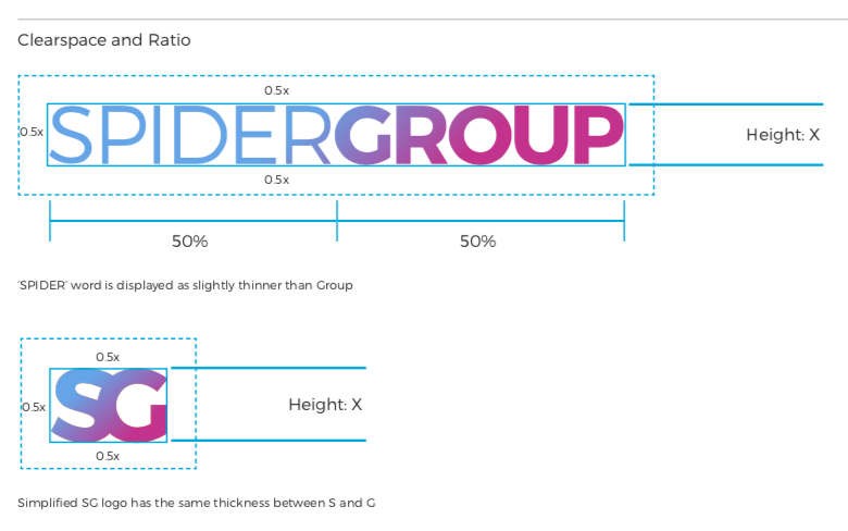
Your logo is often a point of reference for your contacts. It somewhat defines your business and speaks volumes about the type of business you are. Now imagine that your logo is a slightly different size on LinkedIn, and a different colour on your business card and flipped upside down on your email newsletter; this gets confusing. Brand guidelines should set out how and when your logo should be used, what size it should be, if and when it can be a different colour. For our own brand guidelines, we’ve made it clear of the two different logos and how people can recreate them on different channels to ensure consistency.

Accompanying your logo specs, you often see a ‘what you shouldn’t do with a logo’ section. This typically consists of examples of your logo used in the wrong fashion to enable your employees to easily identify if a logo is being used incorrectly. It’s not rocket science, but it can really help to cement your brand image for your current clients and increase your brand awareness for prospective ones.
Colour Palette
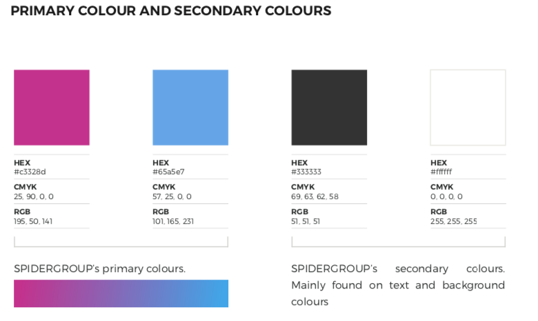
With a clear logo for your business, you can create a colour palette that best reflects your brand. This often consists of colours in your logo, but you may want to try contrasting colours or think about the mood perception of certain colours to find a palette that works for you. Yellow hues are often associated with happiness and creativity whereas red seems more extreme, adventurous and energetic. Find a range of primary and secondary colours to showcase your brand and make sure the exact colours are included in your brand guidelines. Make it easy for your staff to find the colours, for use in general documents and templates.

Typeface
It’s often the case that a business will use one primary typeface and then have one to be used alongside it for contrast and often a third as a backup if any of the fonts are unavailable. Microsoft Word does have a quite limited font supply so if you choose to download an external one, make sure the web address or download location is clearly indicated in your brand guidelines.Using contrasting fonts or styles often helps to accentuate titles and adds some contrast to the page or document. Having a backup font in case your employees maybe can’t download one, that is readily available in Word, is always a good idea. Your brand guidelines should indicate which is the primary font and when you should use it.
Templates
Your business’ chosen typeface for headings, as well as logos, are all best kept in a globally used template. You’ll need a template for a variety of different formats and mediums such as A4 Word, A5 Word, PowerPoint, Google Docs, or whatever you use.Make sure the template’s location is clear, and your employees know which headings to use and where for maximum consistency.Now, that’s the design elements of your brand pretty much covered. If you use illustrations regularly, or any other design features, remember to include them as well as helpful hints and how-tos for your employees to find easily. The end goal here is to make it as easy as possible for your employees to reflect your brand image the right way.
Tone of voice
Any business or brand has a tone of voice. They may just not have realised it yet. When constructing your tone of voice, you need to think carefully about how you want your brand to be seen. This can depend on the industry you are in. Think about Innocent; they are very playful in their content and unrefined, which closely relates to their smoothies being ‘innocent’, they don’t hold back or restrain but they do it in a friendly way.Or how about British Airways; their content and imagery is much more luxurious than other brands to create the effect that they are an upmarket flight company. It all comes down to the way you portray your message.
Some questions you may want to ask yourself are:
- What is your brand personality?
- Are you casual or formal?
- Contemporary or traditional/established?
- How can you convey this brand personality?
- How will your target audience respond to this tone?
- What tone does your audience broadly use?
- Will you use slang language and colloquialisms?
- What about jargon?
Grammar and punctuation
It’s a bit of a boring one (no one wants to be the grammar police) but setting your grammar and punctuation out here should help to dispel those office bickers or inconsistencies.For example, after a semi colon; would you follow with a capital letter? Would you like to use and or &? We can’t possibly use contractions, or we cannot?Having these rules set in stone helps to formalise the tone of voice and ensures your staff are all on the same page.
Your brand guidelines
What’s most important for your brand guidelines is that they are saved somewhere everyone has access to, and everyone knows them inside and out. And lastly, that they work for you.
If you’d like a hand with logo design or establishing a voice for your digital marketing in Bristol or across the South West, then give us a call! We know it can be difficult to nail your brand guidelines, but once you’ve got it right, your brand personality can truly grow! You can reach us on 0117 933 0570 or you can fill in our contact form and we will be in touch!
Psst! Did you know that you can claim a free digital marketing and website review with us? We’ll analyse your current tactics and give you practical advice for improvements!


